
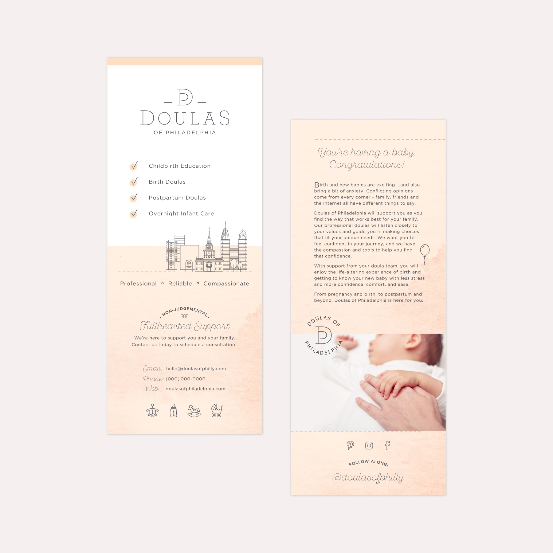
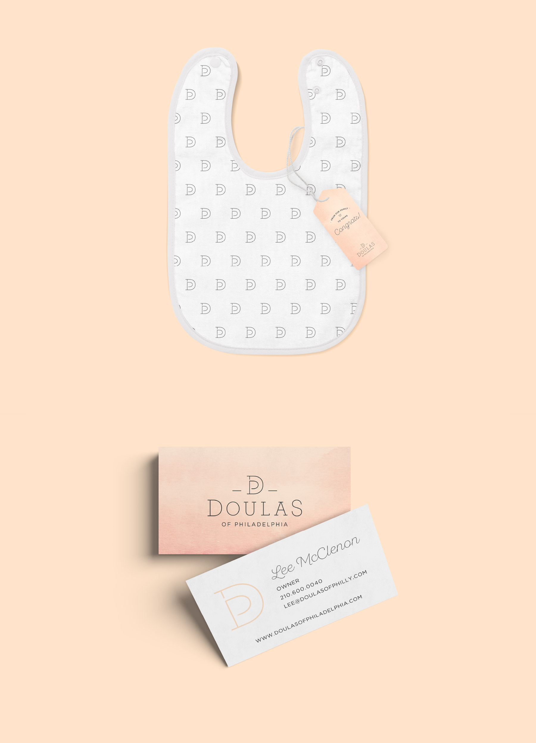
Doulas of Philadelphia
A multi-layered, meaningful logo and custom illustrations combined with warm, whimsical branding elements for a doula and family support agency
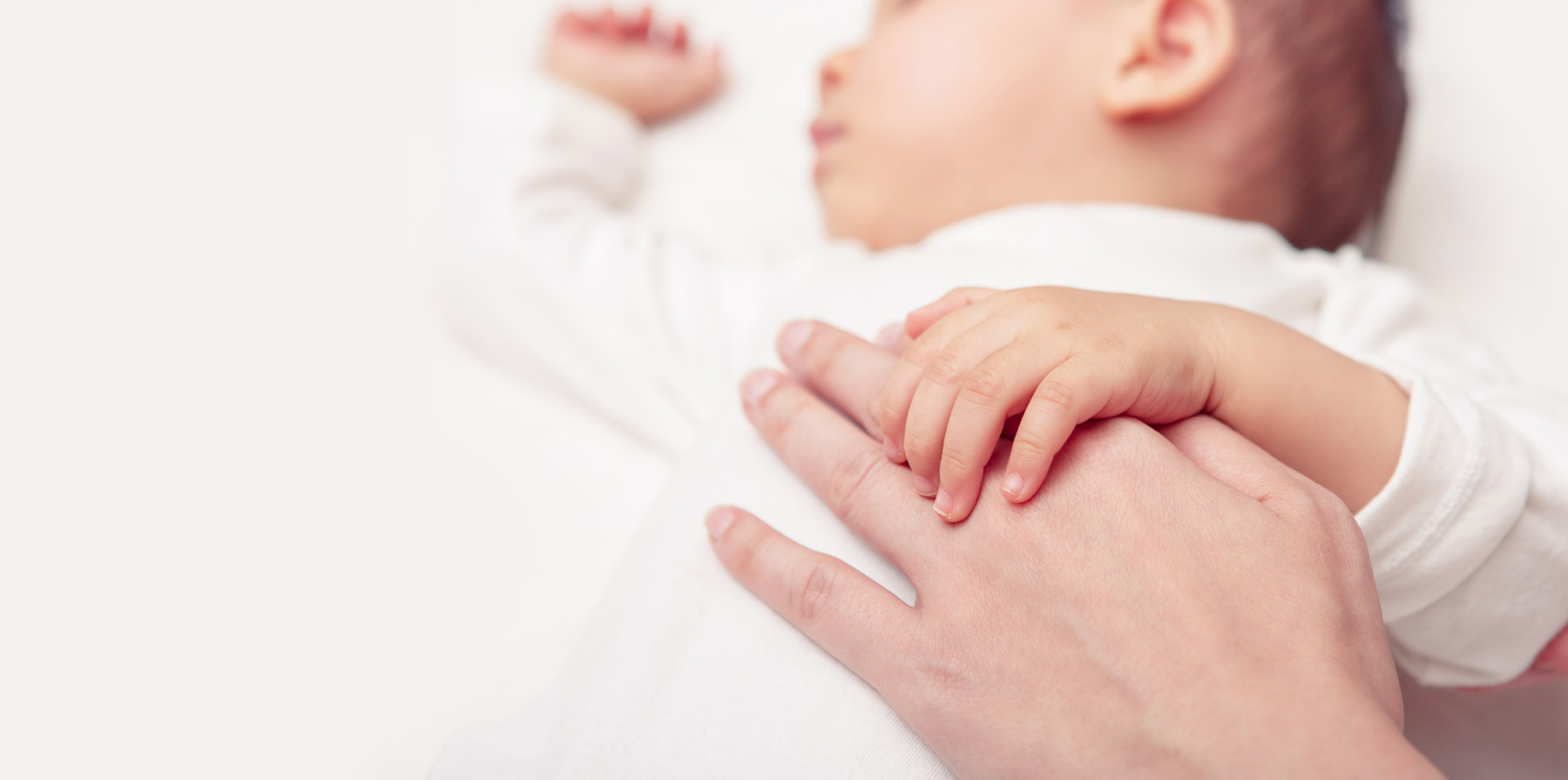
Lee McClendon, a certified doula, created Doulas of Philadelphia, an agency that provides labor and delivery support, as well as postnatal support, for growing families as they transition into a new phase of life with a bundle of joy. For Lee, it was important to project an inviting, credible, comforting persona to her families during one of the most exciting (but stressful) times of their lives.
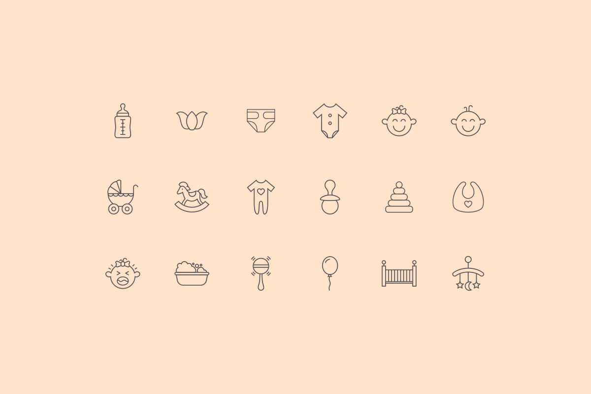
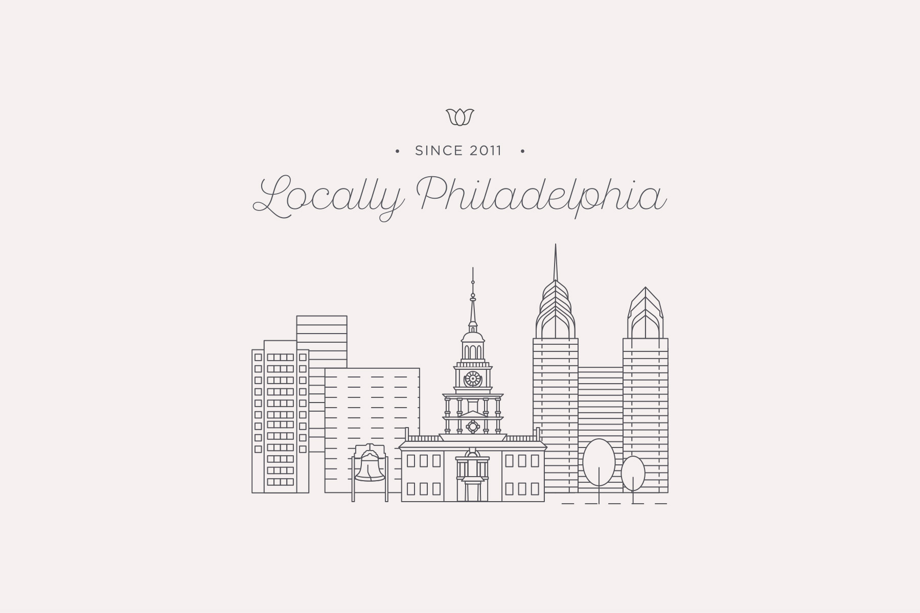
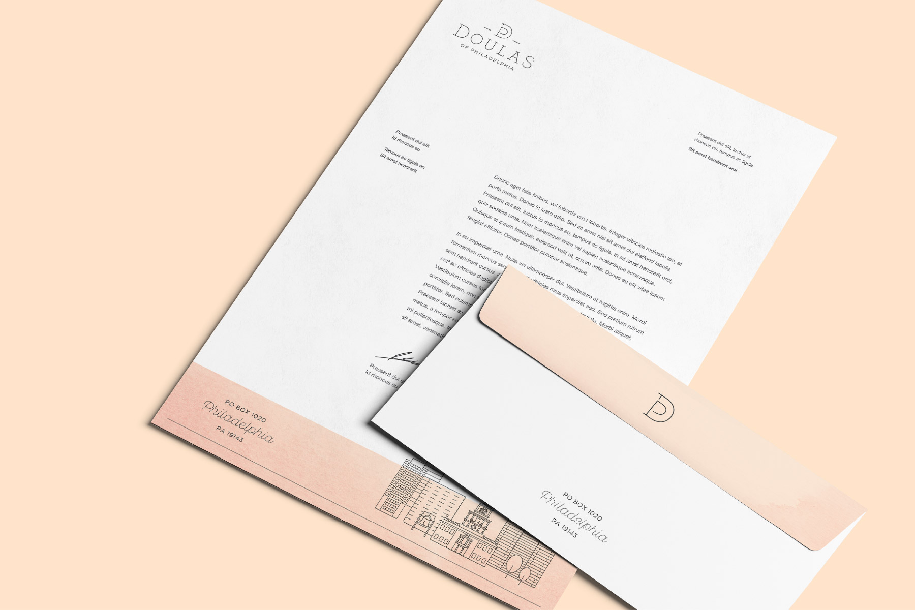
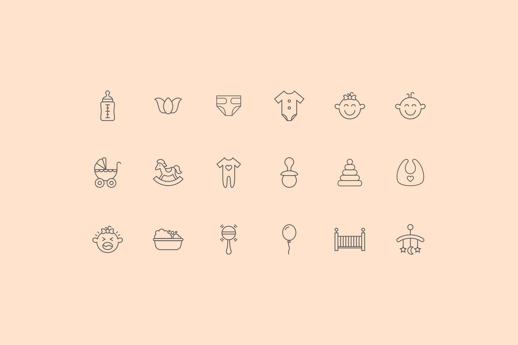
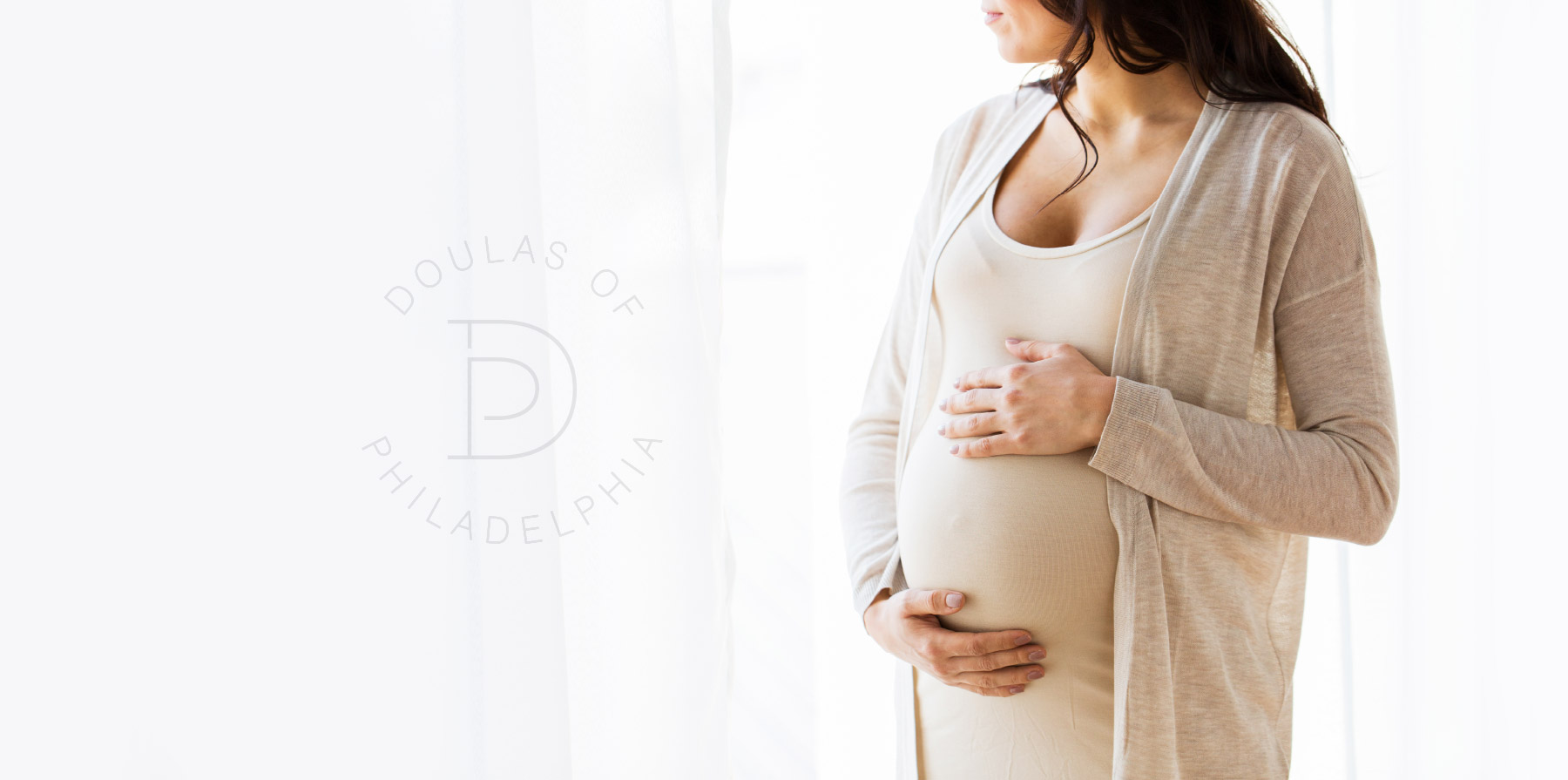
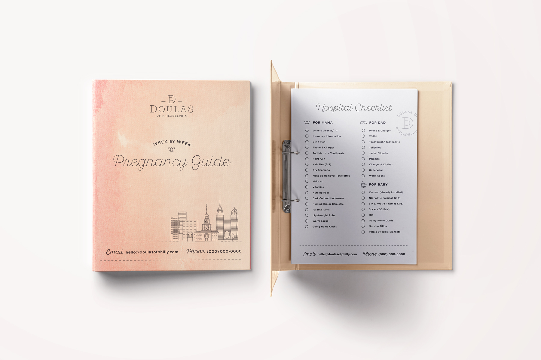
Beginning with the logo, we wanted to incorporate layers of meaning through a mark that reflects the rounded curves of a growing belly, as well as a Hopi symbol, Tapuat, with lines curving and surrounding, representing the mother and child connection. We reflected the confident, soothing nature of Doulas’ philosophy into the brand story through the use of calming, warm colors, including subtle hints of watercolor, and clean, whimsical, minimalist illustrations. Of course, the custom, Philadelphia-specific illustrations we created reinforce a sense of locally-tailored service and expectations. Each aspect of the visual identity radiates both joy and a sense of newness.